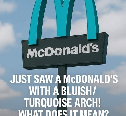
Wow! Why One McDonalds Has Turquoise Arches!
If you’re driving through the wide-open desert around Sedona, Arizona, the landscape does most of the talking. The red rock formations tower over everything, the light shifts every hour, and the whole place hums with an atmosphere people often describe as spiritual. Sedona looks and feels nothing like the rest of the country, and that’s by design. The city protects its environment with ironclad building rules, pushing back against anything that might cheapen the scenery. And because of those rules, Sedona ended up with something no other place in the world has: a McDonald’s with turquoise arches.
Everyone knows the golden arches. They’re a global symbol — bright, loud, unmistakable. You can land in a foreign airport, step outside, and spot that yellow “M” from half a mile away. It’s one of the most aggressively recognizable logos ever created. But in Sedona, none of that mattered. When McDonald’s planned its new location back in 1993, the city took one look at the usual golden sign and shut that idea down immediately. Against Sedona’s signature red cliffs and desert hues, the gold would stick out like a warning light. City officials weren’t willing to let any commercial branding disrupt their view.
Sedona’s building codes reflect a long-standing philosophy: nothing should visually compete with the natural backdrop. Urban clutter, neon signage, reflective surfaces, or hyper-bright colors aren’t acceptable. What works in Phoenix or Los Angeles doesn’t work there. The red rocks come first, always. So when McDonald’s approached the city with its standard design, the answer was simple — the sign could go up, but not in gold. If the company wanted to operate in Sedona, the arches had to blend into the desert’s earthy tones instead of screaming over them.
After negotiations, the compromise landed on turquoise. It wasn’t just random. Turquoise shows up in Southwestern art, jewelry, and architecture. It fits the region’s culture and sits easily against warm desert colors. The final decision wasn’t about clever branding or an attempt to go viral decades before social media took off. It was about respecting the landscape. And to McDonald’s credit, they went along with it. They didn’t fight for the yellow. They didn’t try to strong-arm the city with corporate stubbornness. They adapted.
What started as a practical concession accidentally turned into something iconic. The turquoise arches quickly became a point of curiosity. Travelers heading into town to check out the hiking trails or vortex sites started pulling over to photograph the unusual sign. It became part of Sedona’s unofficial tour circuit — alongside the Chapel of the Holy Cross and Airport Mesa, you now had “the McDonald’s with the blue arches.” People began posting photos, blogs highlighted it, travel magazines mentioned it, and the location became recognizable far beyond Arizona.
Over the years, the meaning of those turquoise arches shifted. At first they were simply a workaround for city regulations. But eventually they morphed into a lesson in how global corporations can adjust to local expectations without losing their identity. McDonald’s didn’t abandon its brand. It just altered one detail out of respect for the environment and the people living there. Ironically, that single adjustment made the Sedona location more distinctive than thousands of golden-arched franchises scattered across the world.
In a way, the turquoise arches strengthened McDonald’s brand instead of weakening it. They proved that flexibility doesn’t dilute recognition. People still know exactly what they’re looking at, but the sign now carries a story — a bit of culture, a bit of local color, a bit of character. Sedona’s McDonald’s demonstrates that adaptation can be good for business, and sometimes the most memorable features come from bending instead of breaking.
The building itself follows the same logic. It’s muted, subtle, painted in desert tones that match the surrounding architecture. You don’t get the sense that the restaurant is trying to dominate the view. It sits in the environment instead of bulldozing its way into it. The arches, soft and cool, glow differently depending on the angle of the sun. At certain times of day they almost look like part of the sky.
The city hasn’t changed its approach since then. Sedona still enforces design restrictions with the same seriousness. Its reputation as a place that protects its scenery is one of the reasons visitors keep pouring in. People don’t go to Sedona to stare at bright signs and cookie-cutter development. They go because it feels untouched. The turquoise arches have become one more note in that broader philosophy — a signal that even massive corporations have to meet the city where it is.
Today, the Sedona McDonald’s isn’t just a place to grab a quick meal. It became part of the local narrative, a symbol of how the town defends its identity. Tourists collect photos of it like souvenirs. Travel guides mention it as an oddity worth stopping for. The story gets passed along because it’s not something you see anywhere else — and because it highlights the quiet power of a community refusing to let commercial noise drown out natural beauty.
The arches themselves tell a story about the balance between global brands and local culture. They show how a simple design change, made for the right reasons, can elevate something ordinary into something memorable. Sedona didn’t compromise its standards, and McDonald’s didn’t lose its identity. The result is a landmark that belongs to both — recognizable worldwide but still unmistakably Sedona.
In the end, the turquoise arches stand as more than a corporate logo. They reflect the character of the city: distinctive, protective of its environment, and not afraid to stand apart from the norm. They remind anyone driving through town that sometimes small choices lead to lasting impressions, and that respecting the place you build in can turn a fast-food sign into a piece of local history.